Dashboards and Finances: How My Product Worlds Overlapped
%20(1).png)
I didn’t expect my career in observability to prepare me for wealth management.
But the longer I’ve built products, the clearer it’s become:
Dashboards aren’t interfaces. They’re how complex systems explain themselves to humans.
That lesson started early for me at Datadog and years later, it quietly shaped how we build Alphanso.
Lesson One: Dashboards Are Not Reporting. They’re Sense-Making.
As an early PM at Datadog, dashboards weren't “nice to have.” They were the foundation.
Every integration: AWS, Kubernetes, databases, queues, ultimately existed for one reason:
to make the system understandable.
Raw metrics were meaningless without context.
Logs were useless without correlation.
Alerts without trends caused panic, not action.
A good dashboard did three things exceptionally well:
- Defined what “normal” looks like
- Surfaced what’s deviating
- Gave you a path to why
That shaped my core PM belief early on:
Metrics don’t matter until they tell a story someone can act on.
A PM Insight: Dashboards Are Opinionated Products
One subtle but important thing Datadog taught me:
Great dashboards are opinionated.
They answer questions before the user asks them.
If you showed every possible metric, you failed.
If you required an explanation, you failed.
If the user needed a runbook to understand the chart, you definitely failed.
A dashboard’s job was to compress complexity into clarity, often under pressure.
That mindset never left me.
The Unexpected Parallel: Wealth Is Also a Distributed System
When I started working on Alphanso, the parallels hit me fast.
Personal finance looks simple:
- Net worth
- Assets
- Liabilities
- Returns
But structurally, it behaves like a distributed system:
- Multiple data sources (brokerages, banks, retirement accounts)
- Asynchronous events (vesting, earnings, taxes, bonuses)
- Latency (cash flow timing, compounding, tax drag)
- Failure modes (concentration risk, poor diversification, missed decisions)
Yet most financial dashboards treat this system as static.
That’s where things break.
Reapplying the Observability Mental Model to Finance
At Alphanso, dashboards again became the root layer, not a surface feature.
I found myself asking the same PM questions I asked at Datadog:
- What’s the baseline state of this user’s financial system?
- What are the early warning signals?
- What’s noise vs signal?
- Where should the user act - and where should the system stay quiet?
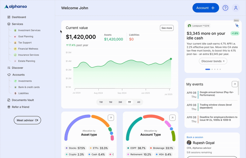
Take net worth.
It’s not a metric, it’s an output.
The real story lives underneath:
- Asset allocation
- Liquidity
- Concentration risk
- Tax exposure
- Upcoming events that could materially change outcomes
At Datadog, we never stopped at “uptime is 99.9%.”
In finance, we shouldn’t stop at “your net worth is up 2.4%.”
A PM Framework: Dashboards Should Reduce Cognitive Load
One mistake I see repeatedly, both in infra tools and financial apps, is mistaking information density for insight.
From a product lens:
- More charts ≠ more clarity
- More history ≠ better decisions
- More metrics ≠ better control
A great dashboard does the opposite:
- It hides complexity by default
- It reveals depth progressively
- It aligns data to decisions
At Alphanso, we think of dashboards as a conversation with your future self, not a spreadsheet you react to emotionally.
Events > Metrics (A Lesson Finance Needs to Learn)
One of the most powerful observability ideas is events over raw metrics.
Deploys.
Incidents.
Scaling events.
Finance has events too - but most platforms bury them:
- Earnings announcements
- Vesting schedules
- Tax deadlines
- Rebalancing moments
- Idle cash building silently
When dashboards are structured around events, behavior changes.
Suddenly:
- Numbers have context
- Timing becomes visible
- Decisions feel intentional, not reactive
That’s a direct carryover from how we built observability dashboards. Reflect that reality: show me what changed, what’s about to change, and what decisions I should make because of that event. Not more charts - more causality.
The Real North Star: Confidence, Not Data
At Datadog, the best feedback we ever got was simple:
“I know what’s wrong within 30 seconds.”
In wealth management, the bar is similar, but more human:
“I understand my situation without anxiety.”
Different domain.
Same product truth.
Dashboards don’t exist to show everything you know.
They exist to show exactly what the user needs to know right now and nothing more.
Two Worlds, One Product Philosophy
Infrastructure runs systems.
Wealth runs lives.
But from a PM lens, they rhyme:
- Complex systems
- Imperfect data
- High-stakes decisions
- Users seeking confidence, not raw information
Dashboards are how we translate complexity into trust.
That’s the overlap I didn’t expect, but now can’t unsee.
If you’ve ever wished your financial picture felt as clear as a great engineering dashboard,
we’ve built Alphanso with that exact philosophy.
If you’d like to see your financial system broken down into thoughtful, decision-driven dashboards, you can schedule a session here. I’d genuinely love to walk you through how we think about it.

Plan with an expert
What to expect


.png)
.jpg)
.png)
.png)